Page 1 of 1
Canon 40D at Columbus Zoo
Posted: Fri Oct 19, 2007 9:45 pm
by BlackRider
Posted: Sat Oct 20, 2007 9:40 am
by XMEN Gambit
You got some nice ones there. I particularly like the snoozing cat and the otter's expression - just for the subject matter - and some of the birds for color.
You could actually bring out the color more in post if you increase the saturation a little and use the levels control to bump contrast a bit.
Posted: Sat Oct 20, 2007 11:22 am
by BlackRider
actually, I was astounded by the color straight out of the camera using default settings. There are some I'd be tempted to mess with, but with some of the birds... I really can't see any way I could improve color.
Also, almost everything at the Columbus Zoo is behind glass... glare and reflections were HORRIBLE as well as muddy paw prints and filth of the inside of the cages... there were times where I went poking through shrubbery so I could shoot through wire instead of nasty glass. The glass wouldn't be so bad if they only had backdrops/walls w/e to cut down on glare... or some kind of anti-glare coating. Glass is great for the human eye... horrible for the cameras. (Though in some places you couldn't even see through the glass w/ the naked eye.)
oh, and the 1st snake picture and all the fish pictures were taken with that 50mm f/1.8
Posted: Sat Oct 20, 2007 11:00 pm
by XMEN Gambit
I really can't see any way I could improve color.
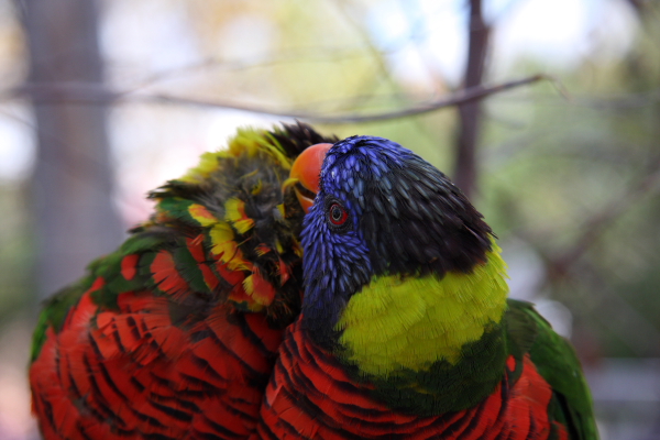
Well, as I've said before, it's YOUR art, not someone else's, and you need to make it the way you want to. But I will illustrate (literally) what I mean, and I hope you don't mind me editing your image. Here is your original:

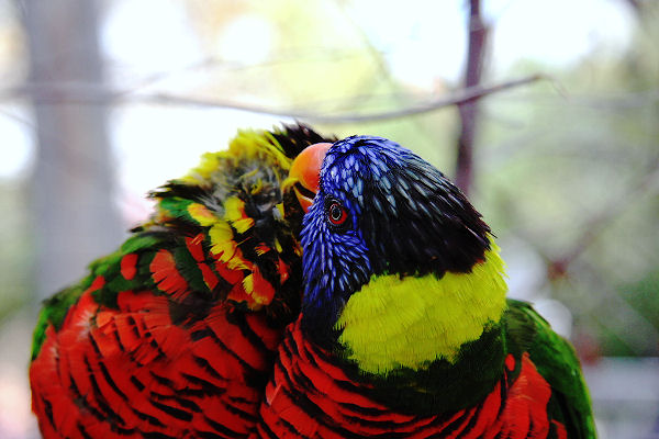
And here it is after a spent a couple minutes with playing with saturation, contrast, and sharpness:

I tried manipulating the photo three different ways, and this is the way I settled on. My first attempt was way too extreme, bleh. This one's much more subtle, and some people I know would say I'd not gone far enough. I brightened it up a bit and so lost a little detail in the background. If you shoot RAW you can overcome some of that. Your original is probably a little underexposed because of the bright background (I do that too) but I don't know what metering mode you were using.
Posted: Sun Oct 21, 2007 12:15 pm
by BlackRider
I see what you mean... now do that to all of them. (j/k)

I like it. It really brings out the color... and it actually improves the texure of the feathers (except for the yellow ones

).
It looks great straight out of the camera... but next to your edit, it does look a little dull.
Posted: Sun Oct 21, 2007 1:17 pm
by XMEN Gambit
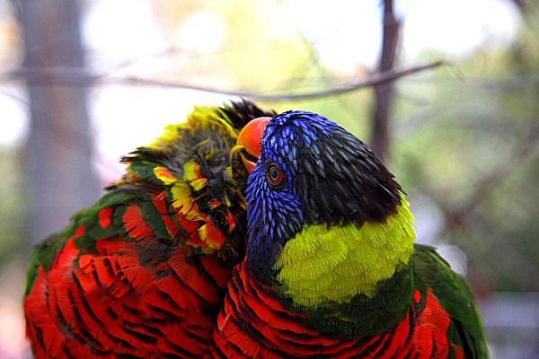
I'm definitely still learning the best ways to post process, so don't take my word as final. One of my other revisions really brought the texture out in the yellow feathers:

Oh, a side effect - the original file is 220k, and my edit is about 60k. Not sure why; I don't think I recompressed or anything. Since it's a jpeg there had to be some loss of info, more than blowing the highlights can account for.
Play with that photo, or one of the others, and just for the exercise try to duplicate what I've done. I'm sure you'll discover other things along the way.


