Page 1 of 1
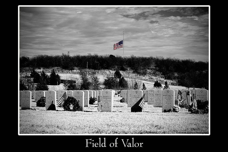
Field of Valor
Posted: Thu Jan 03, 2008 3:35 pm
by XMENPorsche
I went to DFW National Cemetary today for the first time. VERY moving experience if you take the time to understand what those men and women did for this country. I had tears in my eyes. Not sure if the image below does any justice at all to the place but I gave it a shot anyway.

Posted: Thu Jan 03, 2008 8:05 pm
by XMEN Gambit
The obvious cloudy sky and spot of color in the flag help your effect. I think the sharp shadows detract, though, at least from that angle. Need more overcast so there aren't the shadows, or maybe a longer-shadowed morning/evening pic.
I was wondering how it'd look with the other flags colored as well? Part of me really wants to get a lot of color in the flag(s), and another part wants to really mute the colors
Posted: Thu Jan 03, 2008 8:56 pm
by TimberWolf
I didn't notice the shadows until you mentioned it Gambit. I like it as is. But more color on the flag can't hurt.
Posted: Thu Jan 03, 2008 9:54 pm
by XMENPorsche
I try to use selective colorization ONLY when I'm trying to draw attention to a particular element. The flag at ½ staff is in color because I wanted to draw attention to the fact that it IS at ½ staff, and of the constant memorial for our fallen heroes. My first version of this image had all of the flags in color. I wasn't happy with it because it came off looking like selective colorization for the sake of selective colorization. Kinda gimmicky and something I try to avoid.
As for the shadows, wasn't a whole lot I could do about that given the fact that it was a bright, sunny day about mid-afternoon. I agree with your assessment, though. I wish it would have been more overcast. It would have added to the overall tone that I was trying for with this image.

