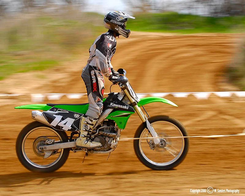
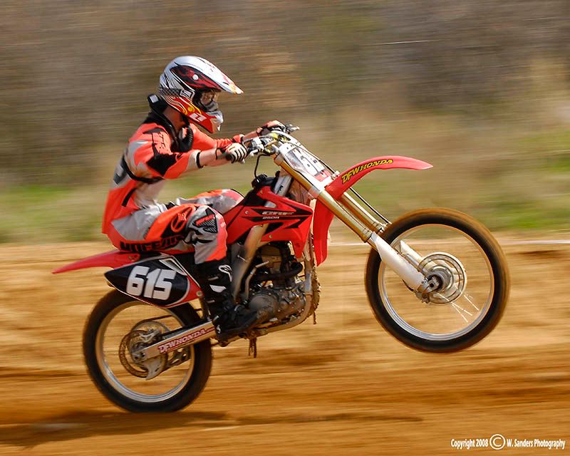
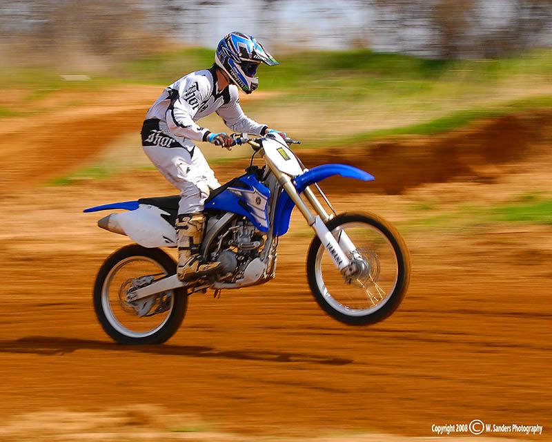
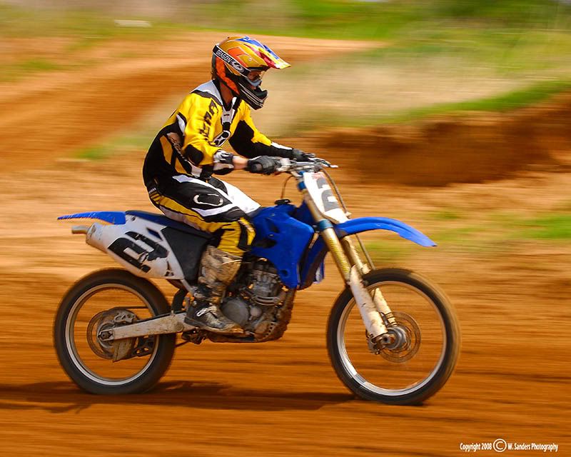
Crowded day at the dirt track today

Non-'puter stuff. Photography, hot rods, or tropical fish for example

Moderator: Moderators

Post Reply
XMENPorsche
Inmate
Posts: 536
Joined: Wed Nov 17, 1999 10:41 am

Crowded day at the dirt track today

Post by XMENPorsche »

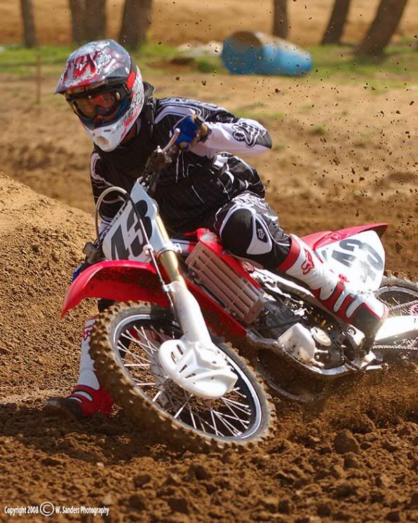
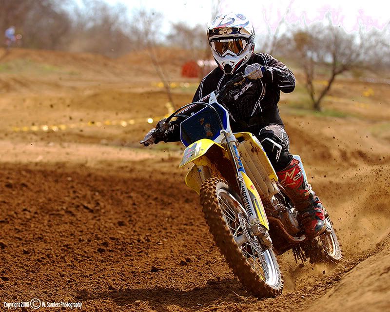
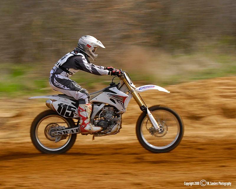
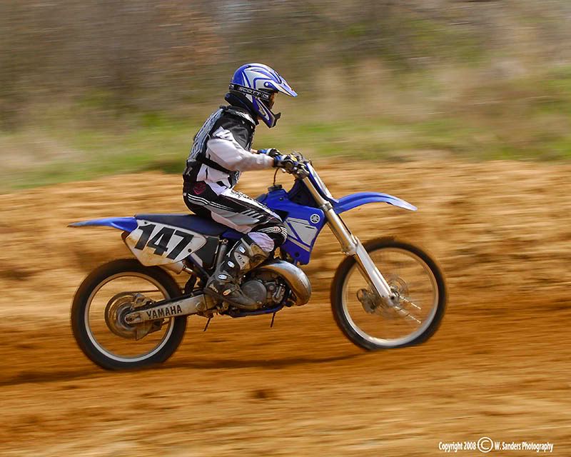
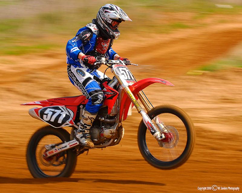
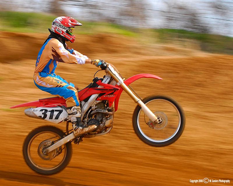
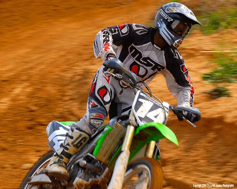
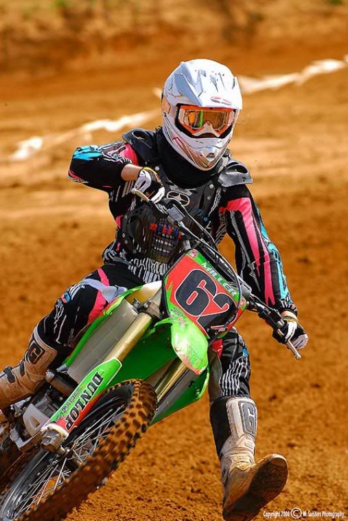
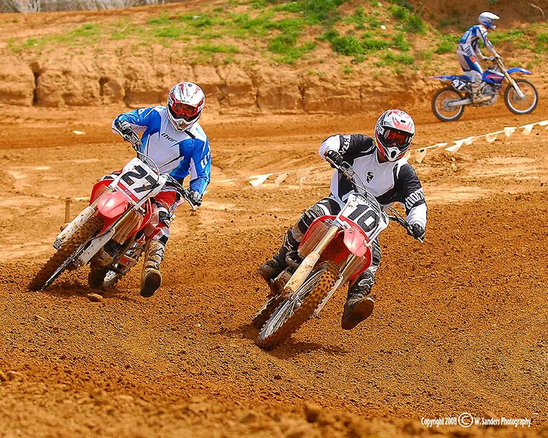
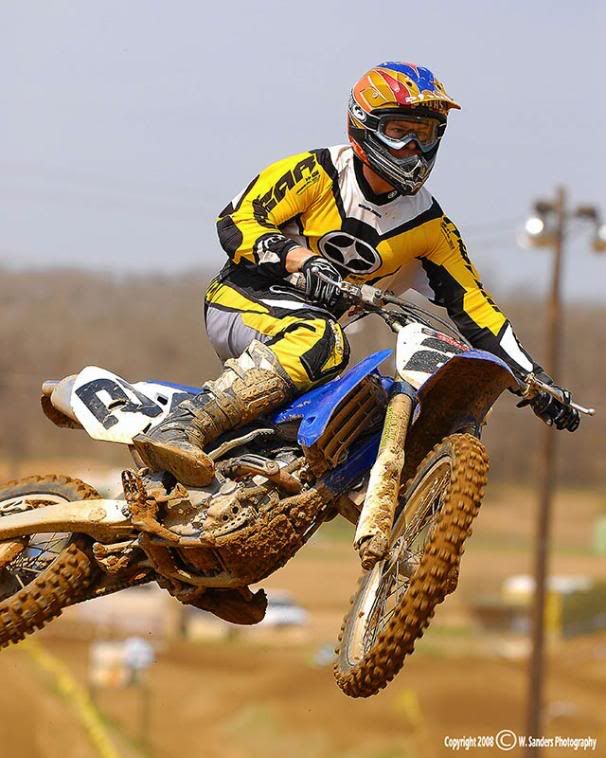
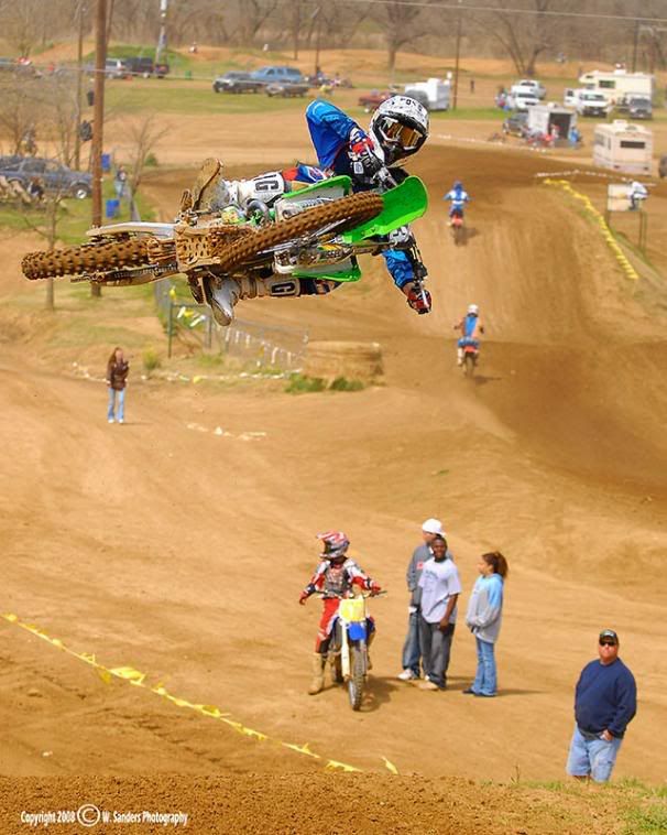
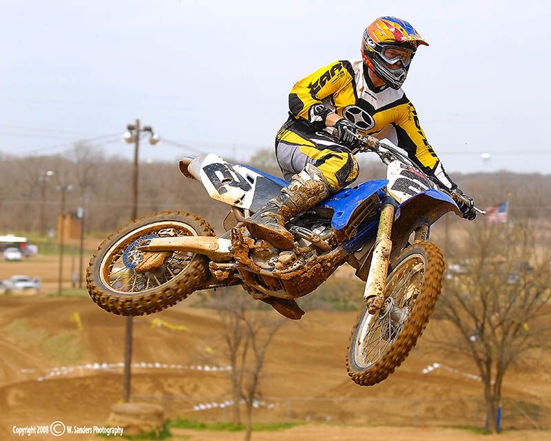
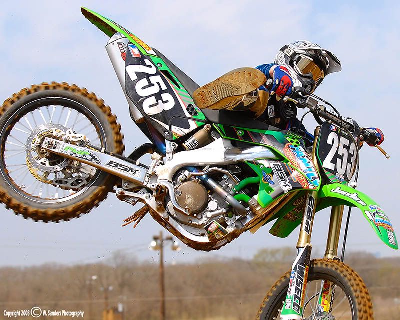
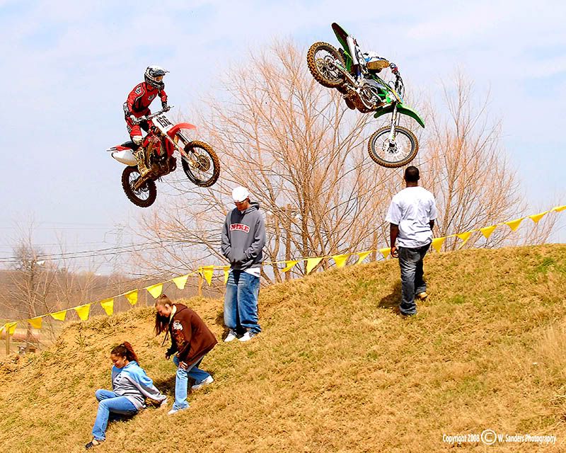
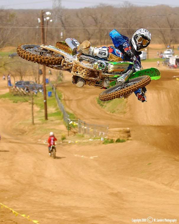
Went back out to the track today. Every since they did a re-design there have been a TON of riders out there. I spent a lot of time working on my motion blurs today. As always, C&C appreciated.

1
Image

2
Image

3
Image

4
Image

5
Image

6
Image

7
Image

8
Image

9
Image

10
Image

11
Image

12
Image

13
Image

14
Image

15
Image

16
Image

17
Image

18
Image

19
Image

20
Image
BlackRider
Inmate
Posts: 966
Joined: Thu Jan 17, 2002 5:26 pm

Post by BlackRider »

As always, they all look great!

As far as criticism... it looks like the lighting was really harsh, but it appears as if the whites are frequently getting blown out. (1,2,3,6,7,10,12,13) But I don't know if stopping down 1/3-2/3 stop would cost you too much of the blacks/shadows... 2 & 8 would most likely lose too much deatil from under exposing... so I don't really know what to do there.

The rider in the background in #13 is kinda distracting, but cropping him out would ruin your composition. Either way, it just doesn't seem to fit with the series as a whole.

#1 is a great shot, too bad it looks like the focus is on the front wheel instead of the helmet.

Overall your colors are great, but the rider's suit in #10 is too contrasty or something. It looks a little cartoony and lacks detail. Though it may just be the color of the suit that makes it look odd.

I don't know if you were trying to draw attention to the spectators in #14-19, but I feel that there's just too much DOF.

I know I'm really nit-picking here and I don't mean to offend... I love the pictures and it was a struggle to for me to find flaws. I keep saying it, but every MX post is better than the last. :wink:
User avatar
XMEN Gambit
Site Admin
Posts: 4122
Joined: Thu Nov 18, 1999 12:00 am

Post by XMEN Gambit »

Heh. In #10, I think it's the suit itself. :)

BR, while some of these are close to blowing out the whites (Porsche does like the high contrast & saturation), I don't think they're over that limit - at least not to me. I'm wondering about your monitor adjustments, as this isn't the first time you've commented on blown whites. If you've got your brightness or gamma set a little high, you could be easily losing detail there.

Having said that, the pipe (?) in #19 does look a little too hot to me. On an absolute scale the sun reflections in #1 is probably hotter and more what a true blowout looks like, but there's just no detail. Not sure what I'm saying or what I'd recommend - both pictures as a whole work fine.

Porsche, I assume you're still using your speedlight for flash-fill?
Image
BlackRider
Inmate
Posts: 966
Joined: Thu Jan 17, 2002 5:26 pm

Post by BlackRider »

Gambit, that's very possible... but I guess I also need to clarify a bit. I don't see any large areas that are blown out, and only very small bits that are completely gone. It's not that there is no detail in the whites, it's more that there is too little detail.... and that the extreme brightness is almost blinding to me. For example, the white helmets against the sky. While the edge between the helmet and the sky is not gone, it does blend in quite a bit.

Also, I love the pictures... I'm just struggling to find anything that could be improved. :wink: I don't mean to be harsh or anything.
User avatar
XMEN Gambit
Site Admin
Posts: 4122
Joined: Thu Nov 18, 1999 12:00 am

Post by XMEN Gambit »

Well, I guess that #2 helmet is a good specific place to bring up.

(And there's the funky purple thing going on there. I think alienz were messing with the camera... Or maybe just Porshe! :D )
Image
XMENPorsche
Inmate
Posts: 536
Joined: Wed Nov 17, 1999 10:41 am

Post by XMENPorsche »

BR - thanks for the detailed critiques. I'll be the first to admit that I have a heckuva time with hot whites. Every time I stop down the exposure to keep the whites in check the rest of the image becomes too dark. I don't think that there are very many here where the whites are totally blown, but you're right when you say that I'm losing detail. MX is a VERY colorful sport, but unless you're lucky enough to have an overcast day it's all going to be under very harsh lighting. Not much I can do about that. I'll live with the hot whites if I can bring out the saturation and colors in everything else.

Also, yes, the riders suit in #10 was.... well, let's say it was different from what you normally see out there.

As for the spectators in the background.... For the most part, I don't do a whole lot of cloning in my track images. This is the environment that these guys ride in. I could go for a shallower DOF but, for the most part, I like to keep it a bit deeper just because these guys can be moving so darn fast.
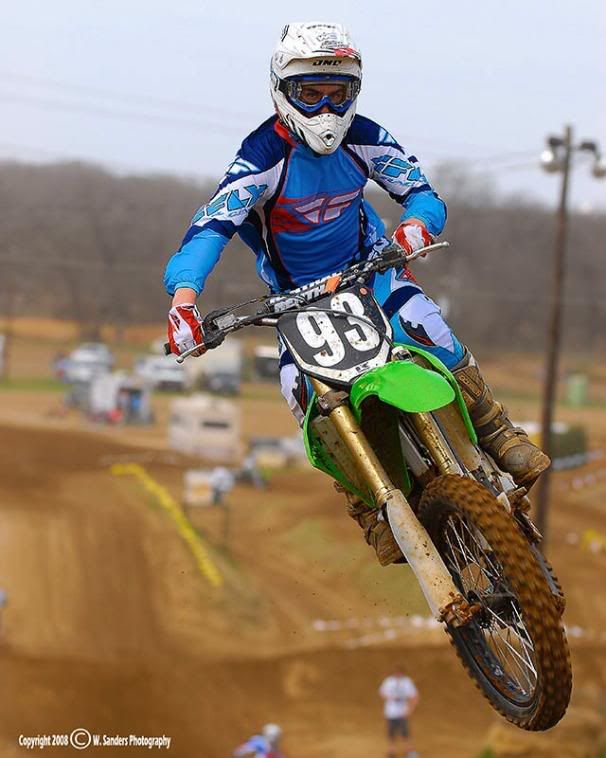
What are you guys talking about with the #2 helmet?

Gambino - yes, I do use the speedlight from time to time. Not on every shot, though.
BlackRider
Inmate
Posts: 966
Joined: Thu Jan 17, 2002 5:26 pm

Post by BlackRider »

The whites of the helmet almost perfectly blend with the sky. Are there lens filters that can alter contrast? I know there are colored filters for B&W, but what about for shooting in color?
Post Reply