As always, they all look great!
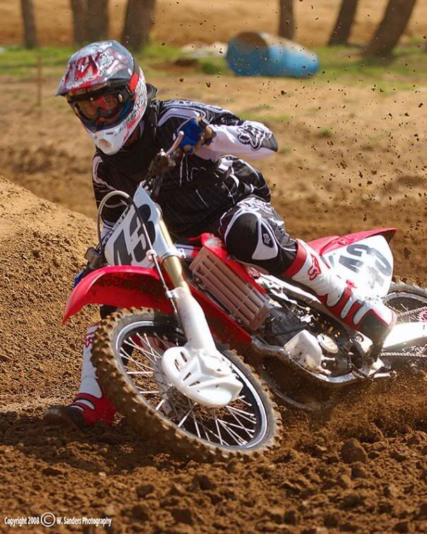
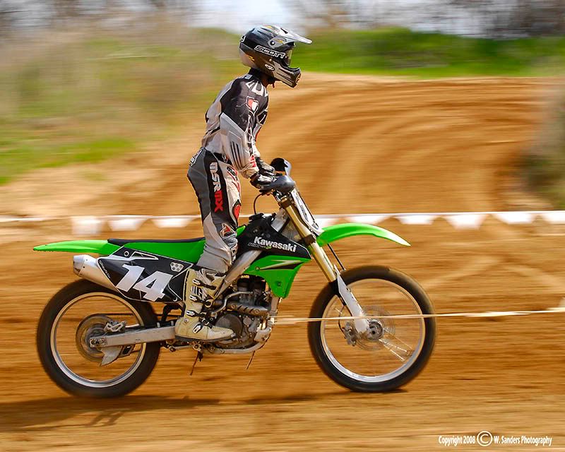
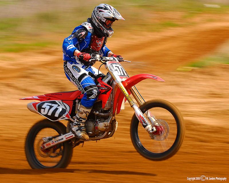
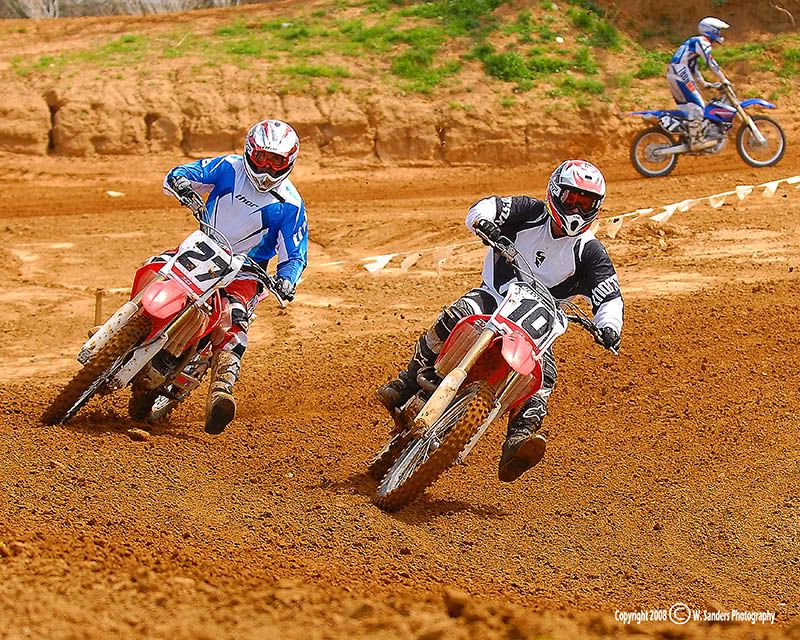
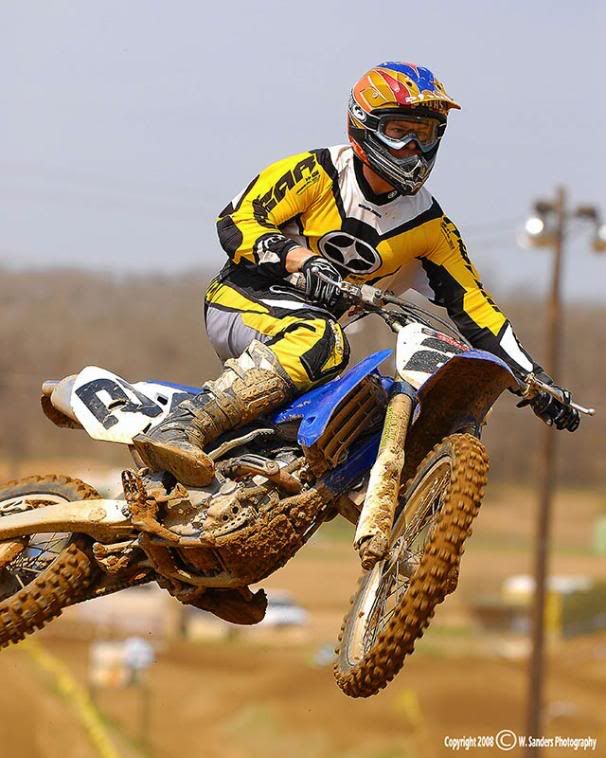
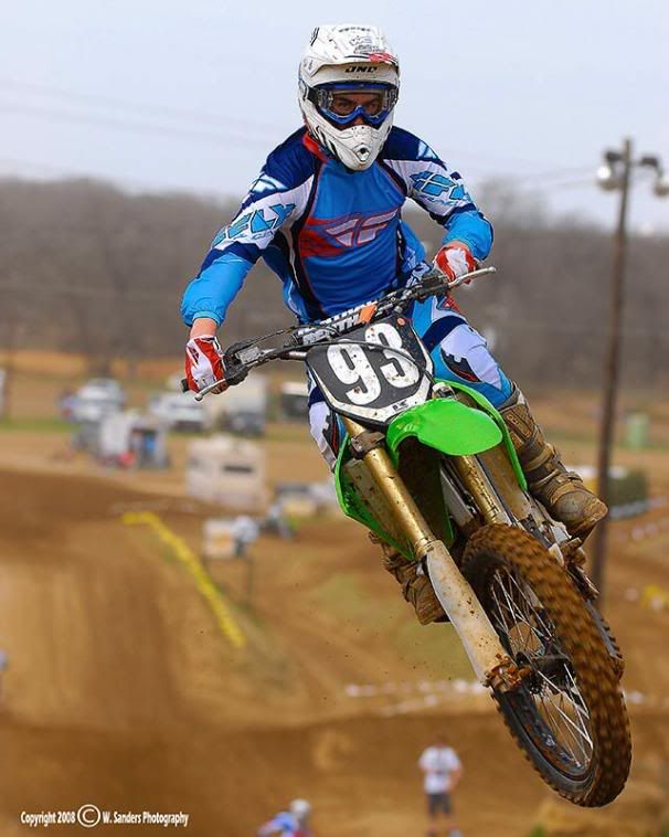
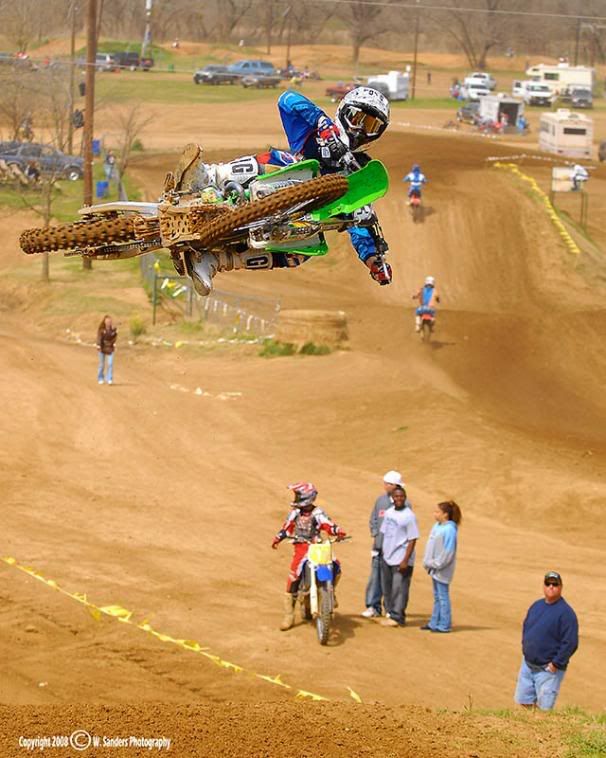
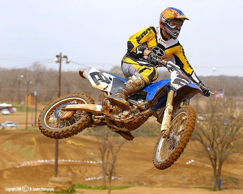
As far as criticism... it looks like the lighting was really harsh, but it appears as if the whites are frequently getting blown out. (1,2,3,6,7,10,12,13) But I don't know if stopping down 1/3-2/3 stop would cost you too much of the blacks/shadows... 2 & 8 would most likely lose too much deatil from under exposing... so I don't really know what to do there.
The rider in the background in #13 is kinda distracting, but cropping him out would ruin your composition. Either way, it just doesn't seem to fit with the series as a whole.
#1 is a great shot, too bad it looks like the focus is on the front wheel instead of the helmet.
Overall your colors are great, but the rider's suit in #10 is too contrasty or something. It looks a little cartoony and lacks detail. Though it may just be the color of the suit that makes it look odd.
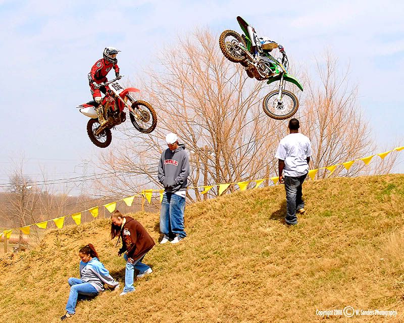
I don't know if you were trying to draw attention to the spectators in #14-19, but I feel that there's just too much DOF.
I know I'm really nit-picking here and I don't mean to offend... I love the pictures and it was a struggle to for me to find flaws. I keep saying it, but every MX post is better than the last.